Categories
Editing Writing

Making A List? Check It (At Least) Twice!

List writing can be a great way to make content accessible and scannable and give readers an overview. Lists are everywhere, and for good reason.

A well-written list can be a quick read, but when making a list, taking some time to properly consider the format and syntax will pay off in clarity and helpfulness for your readers.

Below, I have gathered some advice for writers and editors dealing with lists, based on my own writing and editing experience. If you have other tips or pitfalls on your mind, please share them in the comments!

Use The Right Kind Of List

It’s easy to think that usage conventions for list types are exactly the kind of thing only writers would care about. If you think that way–I have myself on occasion–then consider this progress screenshot from a WordPress backup plugin that I recently installed:

Screenshot of a message saying DO NOT DO ANY OF THE FOLLOWING and goes on to list in numbered sequence 3 actions not to perform while the installation is ongoing. When making a list, try not to confuse people more than necessary.

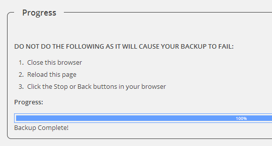
Without reading this multiple times, would you feel certain that you were actually not supposed to do anything mentioned in this numbered list? The introduction says one thing, but the choice of list type is communicating something different entirely.

Use an ordered list if you are describing any of the following:

  • a procedure to follow
  • a sequence of events to observe
  • a clearly prioritized order

Some may also prefer alphabetical ordered lists for options where only one may be selected (“Do one of the following: a. b. c. d.”).

If the list is not a sequence, an unordered bullet list is the most common option. However, long bullet lists are not particularly easy to read. For lists that are long and/or include a lot of information in each list item, these two other options are worth considering:

  • description lists (definition lists pre-HTML5) for glossaries, metadata listings, and similar. These tend to be styled in a manner that make them a lot more scannable than bullet lists. See Mozilla Developer Network for a good description and examples.
  • tables. I know, tables are not actually lists, nor do they have the Twitter or Pinterest appeal of a Top 5 list, but for reference-style material, a table provides much better findability and overview than a bullet list.

I like lists, I’m controlling, I like order. I’m difficult on every level. (Sandra Bullock)

Avoid Redundancy

List items that start identically, or semi-identically, reduce scannability. Keep in mind that tables of contents are also lists. If you have a table of content that is generated based on your headings, considering each heading a list item is useful.

To ensure list items remain scannable, you can:

  • front load each list item by starting with important keywords that set it apart from other list items rather than something generic , such as “You will need to …” or “For simplicity and ease of use, we have …”.
  • move repetitive phrases outside of the list itself. For example, instead of starting each list item with “how to”, make “how to” part of the introductory phrase that comes before the list.
  • drop any words and expressions that don’t add to the meaning. In most cases, list items don’t need to be complete sentences.

As a bonus, if your writing will be translated, you’ll save money by avoiding redundancy.

Every morning I get up and look through the Forbes list of the richest people in America. If I’m not there, I go to work. (Robert Orben)

Be Consistent

In a list, each item should have a similar syntax. This is a pet peeve that probably annoys me as a writer more than most readers, but I have seen plenty of bullet lists that would be confusing for any kind of reader.

Before unleashing a bullet list on the world, read through it starting with the introductory phrase and check that all list items:

  • start in a similar fashion to the others and read as a grammatically correct continuation of the introductory phrase. If the introduction says: “This chapter will tell you how to:”, you cannot have list items starting with “making” or “configuration”.
  • share the same grammatical subject or state their subject clearly. Otherwise you may easily conflate, for example, something done automatically by software with something  users must do themselves, or something the software vendor can do for you upon request. In my experience, this problem is not uncommon in lists of features and software specifications.
  • use similar syntax and punctuation. Mixing questions with statements in the same list will usually not read well. Whether or not to end each list item with a full stop is a style/preference issue. It is also painfully hard to remember and follow up on in a consistent manner.

We like lists because we don’t want to die. (Umberto Eco)

Categories
Software Development Technical Communications Usability

Helpful Error Messages For Fun And Profit

Nobody is keen to invest in error messages. And by invest I mean energy, money, man hours … Declare “Our product will excel at failing gracefully”, and you can probably count on your stakeholders to drop off after “excel at failing”.

Everybody fails (sometimes)

But every. Product. Fails. Networks happen, unexpected input happens, integrations with other products happen. The real world happens, and what do we do then?

My last post about unhelpful error messages sparked some interesting comments and discussion, on the blog and in the Technical Writer in Action LinkedIn group, including a lot of good points about what fellow tech writers consider to be good qualities in an error message. I said I would follow up my post with a more constructive take, and here it is.

1. Fight the power (push back, fix the code)

Rewriting error messages often runs the risk of being lipstick on the proverbial pig. Sometimes it’s all we can do as writers short term to improve the writing, but we shouldn’t be scared to push back and look at whether the product is behaving as it should in the first place:

  • Could the error be prevented before it happens? For example, improve the UI to prevent users from entering invalid input, highlight required fields, and so on.
  • Is the error displayed to the right users? Misconfiguration in the backend should raise a ticket for whoever configures the backend, rather than cause ugly error messages for the end user who can do nothing about it. Messages that essentially say “Contact your administrator” should rather say “Your administrator has been contacted”.
  • Is one error message enough? One of my most frequent requests is actually more error messages. For users, more messages can actually be a good thing, because they allow us to be more specific. Too often, developers create catchall messages that cover so many scenarios it is close to impossible to give users instructions of any value. A shocking amount of error messages can be paraphrased as: “This, that, or the other may have happened. Try 547 different configuration changes, or wait an hour or two and it may have gone away.” Not helpful.

2. Find out what it means to me (respect the user, be instructive)

Good error messages are respectful of users and their time. Conciseness is a value in and of itself. Users read this stuff to do, they don’t read to learn. For this reason, I find that going into detail on exactly what has happened is often not the best use of screen space and user attention.

For the user to be able to do, the message must be instructive. An instructive message focuses on why the user should care about this message, and either give them reassurance that someone else will fix the problem, or give them the information they need to act themselves.

This information needs to be:

  • specific
  • inclusive enough that it doesn’t entirely exclude potential scenarios. Few things are more frustrating than following instructions that turn out to have no relevance.

When working on pop-up messages, I always try to pay attention to the buttons as well, and aim for descriptive action verbs. Users may find having to click “OK” after reading about a critical error downright offensive, and it does not tell them what happens once they have clicked the button, either.

3. Only when I laugh (don’t try for funny)

A final word of advice: don’t try to be cute or funny.

I have seen several people insist, after my previous post about humor and error messages, that it’s fun and appropriate if the error isn’t very serious, such as a 404 not found message.

Instead of reiterating my first rant, let me tell you a story:

A few months ago, I visited a newly overhauled website that was boasting about its new backend and look and feel. I tried to use the site search, but clicking on links in my search results repeatedly took me to a “hilarious” new 404. Clearly, some pages had gone missing in their migration to a new platform. These things happen, of course, but “funny” not found pages pretty much assume that the user has clicked on a random rotten link or entered a wrong URL. In my case, I could not find the content that the site’s own search results promised. My frustration was mounting. Spare me the jokes!

Point of the story: it’s hard to predict all the scenarios and situations users will be in when they see our error messages. It is, in fact, about respect. You show it, or you lose it.

That’s what it’s all about

Creating helpful error messages can be very hard, but it’s so worth it. I would say it’s about the best use of a technical communicator’s time I can think of. Troubleshooting is where users tend to get the most frustrated, and better instructions in the product simplify troubleshooting. Less frustration, happier users. And happier users is what we should be all about.

(Photo by Gerry Balding on Flickr)

Categories
T-shirts

T-shirt Love: Grammar Police

This is one of my favorite shirts. I regularly wear it to work–in fact, I’ve been wearing it enough that I may need to replace it soon.

Working with tech writing, I spend quite a bit of my time assisting in the writing and editing of text for user interfaces, as well as helping colleagues with other types of text. I bought this shirt for fun, but I think it has actually served a purpose as well. I am getting more “hey, grammar police, can you help me with this” requests from colleagues who are not writers, and I think the shirt has helped make it clear that I don’t mind this aspect of my job–in fact, I rather enjoy it. People realize they are welcome to ask for my help, and that if not, my help may still be … let’s say volunteered.

Bought and still available at One Horse Shy.